You’ve decided on your business and chosen your designer, and now you’re ready to select the business colors that best represent you for your brand kit and brand assets. This is one of the more important tasks for your business. The colors that you choose will define how others view you, the mood of your business and even how much your company is trusted.
Your color choices will impact a number of future considerations, including printing costs for media and collateral. This is why many small companies simply choose black and white. Black and white can be effective when used properly, and it will never increase your print costs.
Factoring in Printing Costs
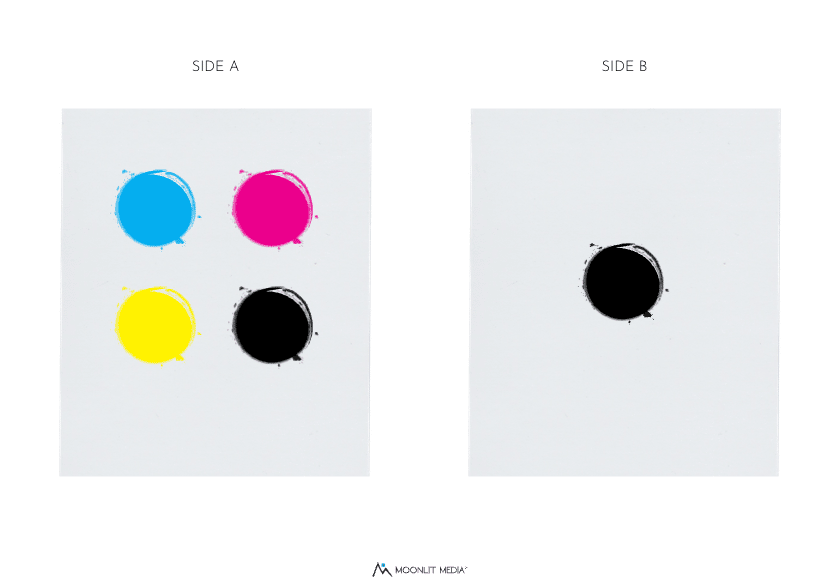
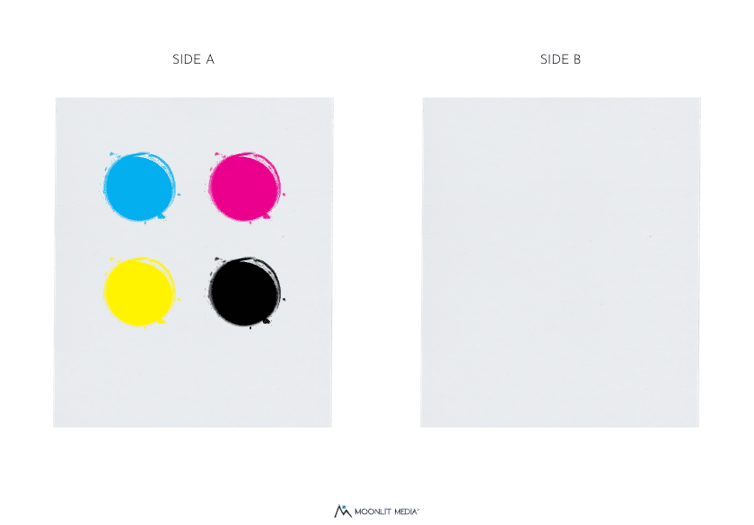
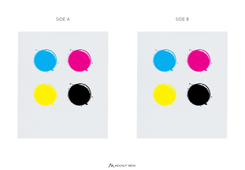
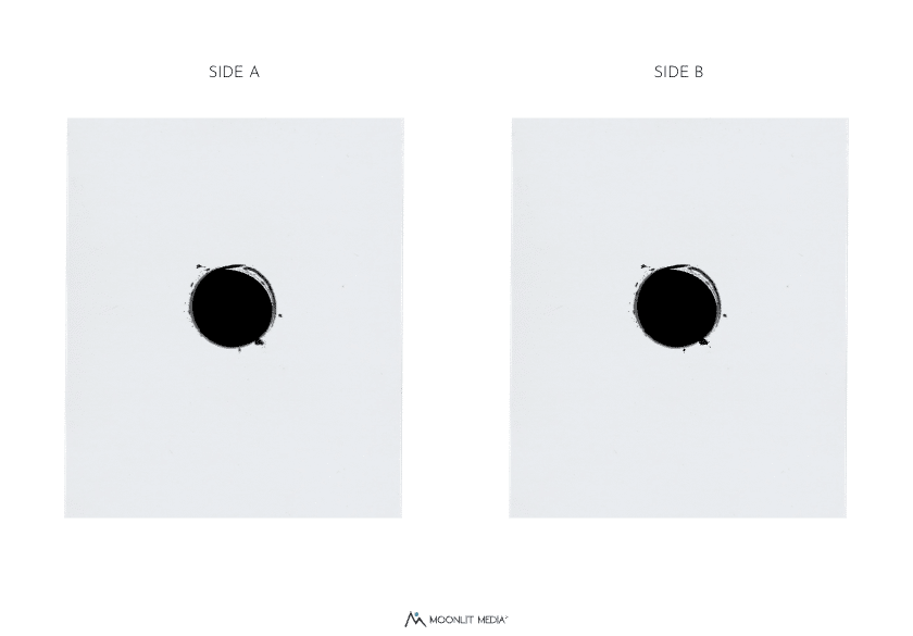
The printing industry focuses on processes. To understand the process, we have to look at the types. Each color has an associated format with it. To that end, each color has the following:
Each of these processes is a way of looking at printing selection.
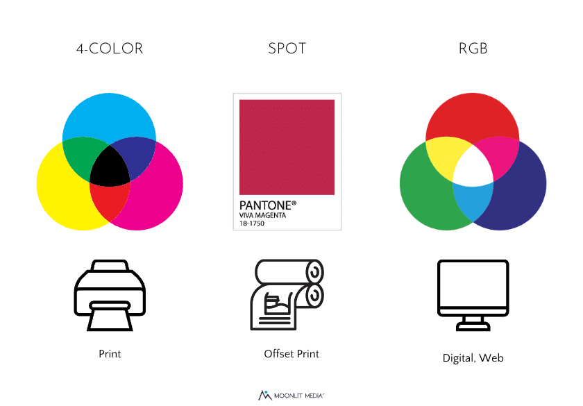
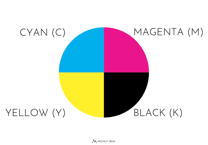
- Four Color Printing is the use of CMYK (cyan, magenta, yellow and black). Together, these colors can form any other color in the wheel by overlapping and shading the base colors. Four-color processes are applied as tiny dots to create the visual effect of a full-color image.
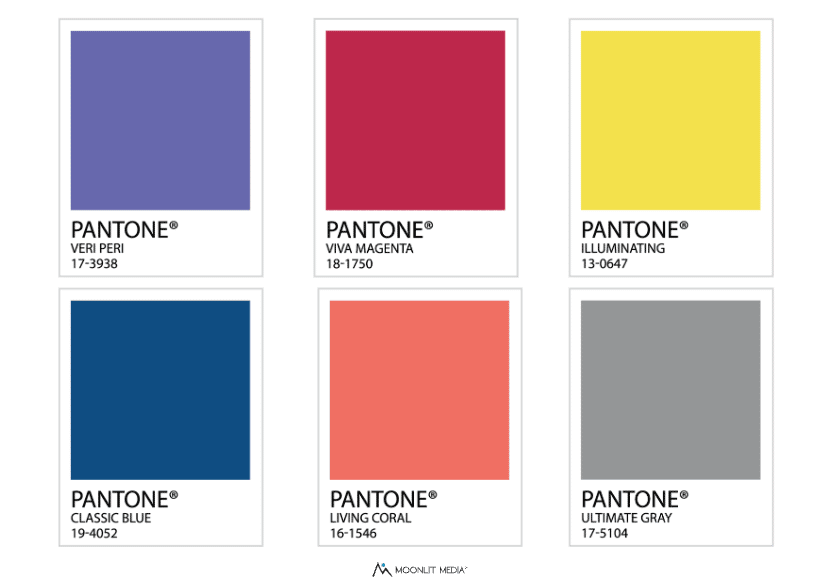
- Spot Printing is slightly different. Each color is mixed and printed individually and can exactly match the PMS (Pantone Matching System) colors. Spot printing uses simple (and most popular) black and white. It’s cheap, effective and recognizable.
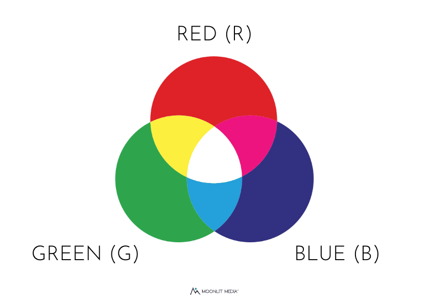
- RGB colors are the use of Red, Green and Blue. This results in a fairly close, but not exact, match to any color.
Color Schemes
With the variety of colors available, we must choose the type of color and understand that it will impact our printing costs.
Color Psychology
There are hundreds, thousands of colors to choose from when you begin developing a logo. The easiest way is to choose a single color, then broaden that focus to contrasting, monochromatic or analogous palettes. Don’t be afraid to ask your customers, friends and family for feedback.
Blue: We often associate blue with a clear blue sky, a beautiful ocean, and wide open spaces. This color is the most popular brand color for a reason – it’s associated with trust, security, confidence, responsibility, inspiration and vigilance. Just take a look at the nation’s flag to see how important this color is to our world.
Blue can be a great option for companies associated with healthcare, banking, information technology and insurance.
Red: Red is a somewhat divisive color primarily due to its association with both love and hate. When you see red, you are considered “angry” (his face turned red). When you’re in love, you associate red with passion and love.
This color also indicates hardiness, valor, and competitiveness. The key to red is to use it in small doses, but if you use it in larger doses, consider offsetting with more “words”. Red can be overbearing, but in small doses, it’s an effective color for small businesses. Need proof? Over 75% of the world’s flags have the color red. This says a lot about our perception of red.
Purple: With 196 countries in the world, only a few contain purple. That’s because purple is generally associated with royalty, wealth, power, ambition and nobility. Not exactly negative, but it can be taken that way if you don’t consider the other connotations which are luxury, magic, devotion, loyalty, independence and mystery. For luxury brands, this may be an effective choice. Choose a font to offset any negative connotation or decide if you want to be seen as a luxury brand that is rather snobbish.
Yellow: Yellow and its variants are often associated with optimism, energy, joy and simplicity. But, on the negative side, it’s often associated with cowardice, betrayal, and danger. When choosing yellow tones, identify the one that works towards joy and intellect. This is also a strong color that can be used to offset other colors.
Green: For many people, green is associated with natural forests, freedom to roam, and calm tranquility. However, it can also be viewed as money, envy (“green with envy”) and stress. Reactions to the color green are highly personal. In most studies, there is an even split between green “motivating” them or “depressing them”.
At Moonlit Media, we begin with one color to use as a focus, then expand to monochromatic shades, monochromatic, or analogous colors to complement the design.
Whichever color choice you make, remember that there are hundreds of variants of each color and you are not limited. But, too many choices can make your page and logo look busy and may lead to a result you didn’t intend.
Popular Big Brand Colors
Let’s examine some color choices from big brands and see how they are used.
Pepsi: Red, blue and white. In the early 40s, the CEO of Pepsi came up with the idea to put the company logo onto the bottle cap and add the blue color to the mix. The redesign pursued two goals – to stand out from Coca-Cola and show support for the United States during World War II (red, white, and blue are the three colors of the US national flag).

Coke: Red, black and white. The color red in marketing portrays power, excitement, energy and passion. It also stimulates the appetite, which makes it an excellent choice when branding food or drink.

Visa: Blue and gold. Trust is critical in the finance sector and many companies choose the color blue to represent their devotion to trust, sincerity and reliability. The gold indicates luxury and authority, while blue represents trust and reliability.

Amazon: Orange and black. Amazon uses two colors in its logo: black and orange. The black color represents supremacy and elegance, while the orange shows pride and happiness.
Tiffanys: Teal and white. Tiffany Blue® has been synonymous with the luxury house since the iconic company first came into the business. The tiffany blue box with a white ribbon is a universally understood symbol. This is proof that a single color can work wonders to brand your business.

Discover: Black and orange. Much like Amazon, Discover relies on a spot of color to bring attention to its company.
Fedex: Purple and Orange. FedEx focuses its colors on two that are evenly spaced on the color wheel. Purple and orange The goal of this logo is to present a feeling of luxury and urgency as well as trust.
UPS: Brown. Brown is an unusual color choice but highly effective for a company like UPS. When we think of brown, we tend to associate it with nature, specifically the ground. It represents possibility, growth, class, elegance and professionalism. According to UPS, the owner suggested a shade of brown similar to Pullman rail cars as it “reflected class, elegance, and professionalism — and dirt is less visible on brown uniforms and vehicles.” Practical and effective!
Whichever colors you select, be sure they are representative of your business, your business ethic, and the feeling you want to portray to your client.
