So what’s a brand kit anyway?
You’ve got your business idea. You’ve worked out your budget. Now, you need a brand identity.
A brand identity is a collection of design choices and assets that make up your company’s personality and its look and feel. This includes your company’s “voice”, “tone”, and formatting preferences. It’s a kit that should be easily available to anyone who works in or with your business.
These choices lead to the development of your brand kit, which will become your company’s “bible” of design choices that represent your company’s personality, look and feel.
The purpose of this brand kit is to ensure that all marketing and communications are accurate and on-brand. This, in turn, helps your company become memorable and quickly recognized by your target audience. Once you have a brand kit in hand, it will help you ensure that all communications look similar – from Zoom backgrounds and presentation decks to letterhead and business cards.
Brand kits allow any designer or copywriter to immediately pick up on your company’s individual style and feel, making it much easier for them to manage your social media, create blog posts, and inspire new design styles.
A Brand kit includes:
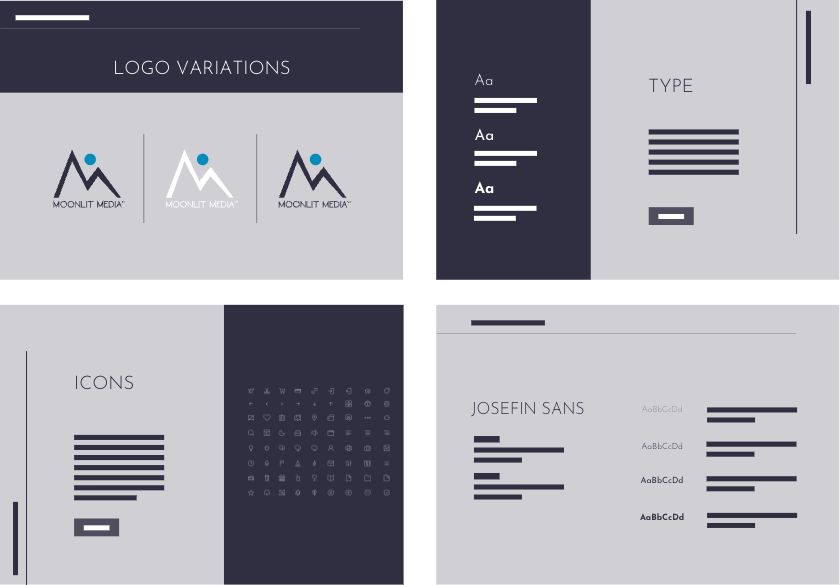
A well-designed brand kit will also include your logo variations, color palette, personality, visual inspiration, and font selection. This comes standard with most of our brand packages.
Should you select a more robust version of a brand kit, Moonlit Media may include font hierarchy, file usage, and instructions for using your brand kit and identity for the development of additional creative assets.
Choosing a Logo
Your logo represents you as a business. This is why it’s important to create a logo that is visually stunning. When someone sees your logo, they should immediately recognize the colors, fonts and design that represent your business.
Choosing Your Brand Font
Your brand fonts are an important part of your brand identity. Fonts have the power to relay the tone of your company — from an “official” or “authoritative” feel to a “playful” feel. They can share your passion for flare or express that your company is devoted to clean natural ingredients. All of this can be accomplished with fonts.
Choosing Your Brand Colors
Your brand colors should be chosen to evoke a feeling. Every color has a “feel” associated with it and there has been a great deal of research on color psychology and how they impact your business.
For example, the entire range of blue (from indigo to teal) tends to evoke feelings of tranquility, harmony, and authority. Be careful, though, as some areas of the world may view blue as depressing.
Yellow is generally associated with optimism and sunshine in business. But, in nature, we see yellow in toxic animals, like several varieties of very toxic dart frogs and caterpillars. This may subconsciously create a desire to avoid a business in some cases. Knowing which colors to use together ensures that the colors you want are used properly in every situation.
In some businesses, there is a focus on multiple color backgrounds but one single color for the name of the business. An example is Medium. Their style guide allows for a variety of background colors, but only when used with an overlying black font.
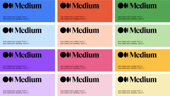
Our graphic design department is committed to helping you choose the best colors for your business.
Choosing Your Brand Images
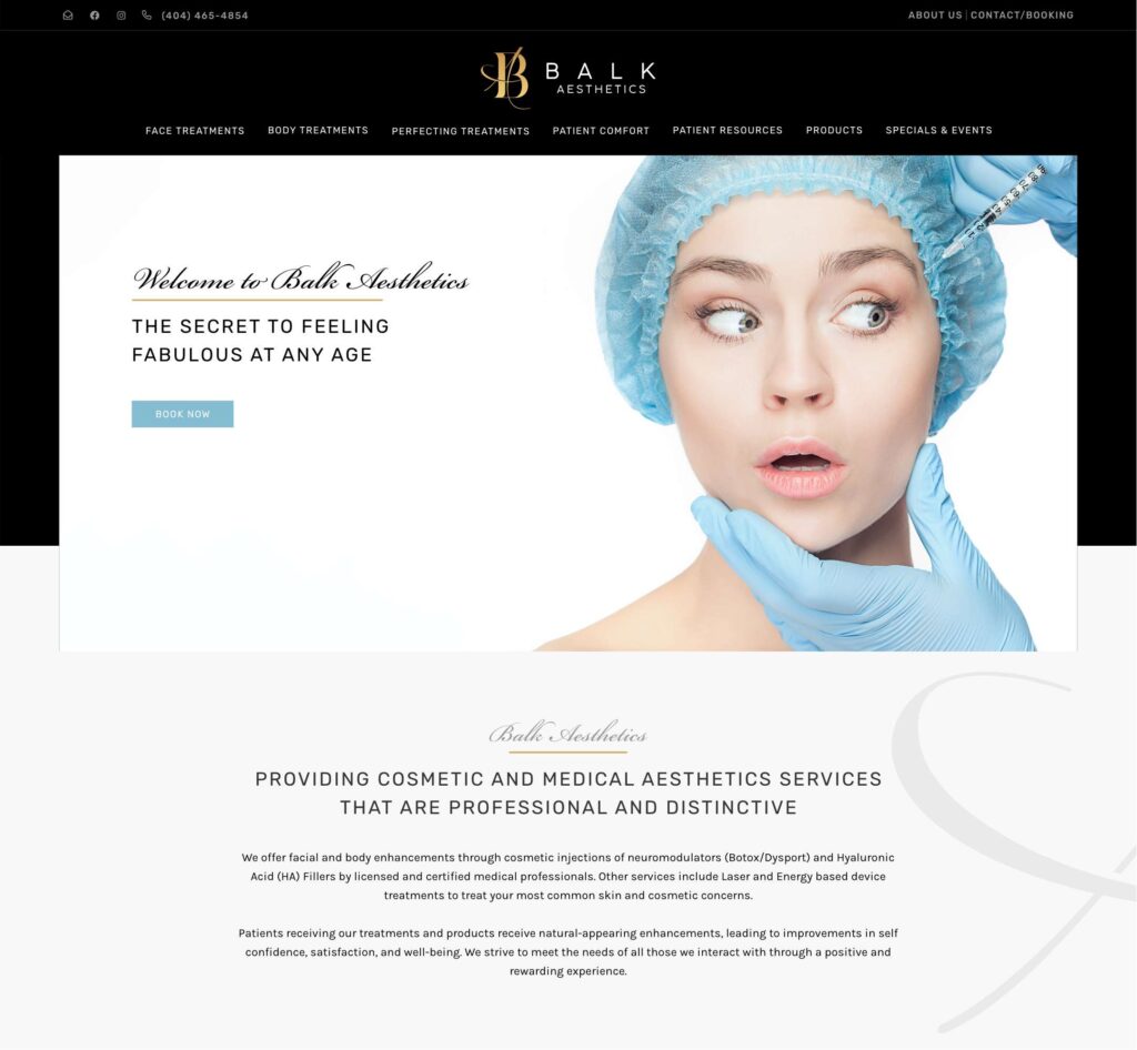
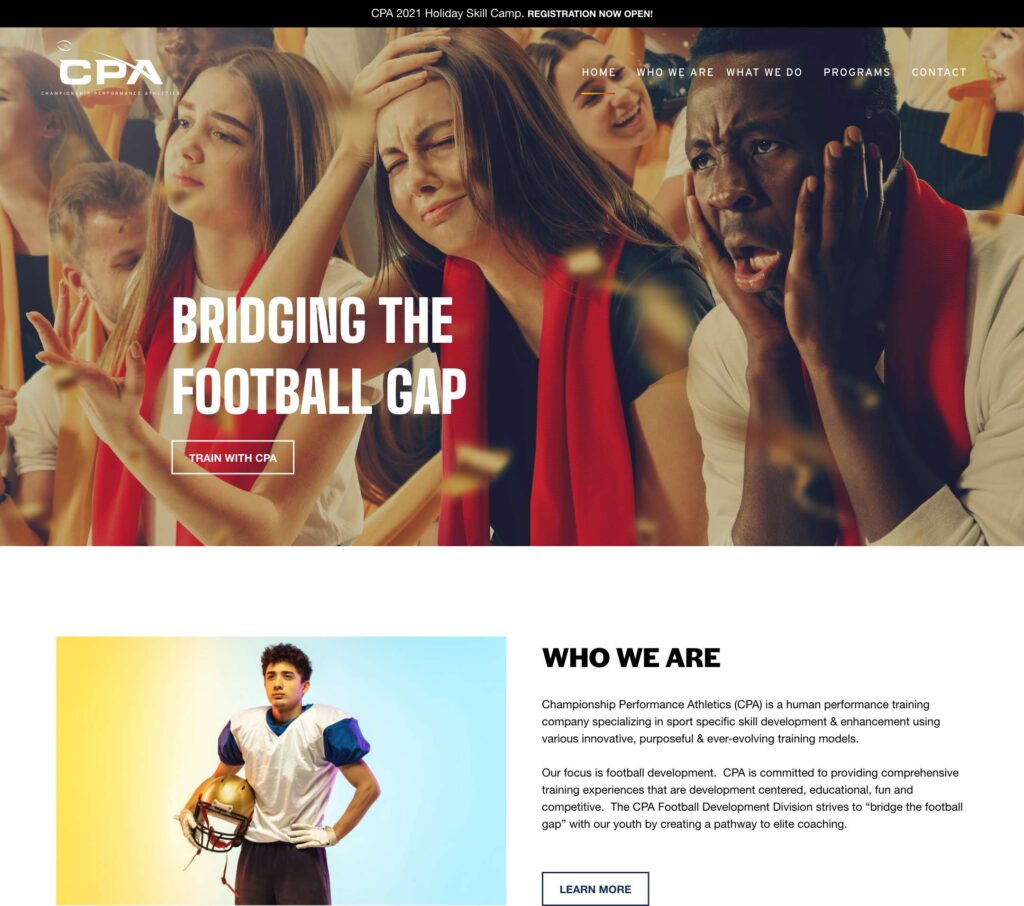
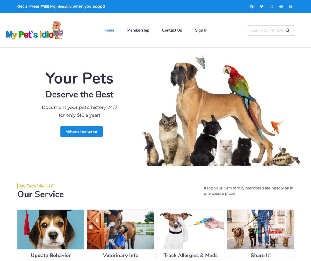
Brand imagery plays a vital role in creating a positive and long-lasting association with your brand. When selecting imagery that represents you and your product, consider how others view the media. They may be images unique to your brand and your product.
When selecting brand images, choose imagery that will create a strong reaction. Think about how the consumer will view your products in relation to their world.
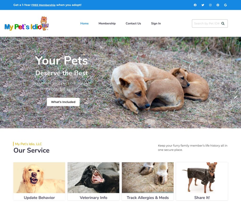
For example, if you have a company focused on dogs, you want to ensure there are no images associated with dogs that appear unhappy. Choose photos of engaged, alert dogs using your products. If you are a jewelry maker, you will want to create images that inspire trust and creativity.
good vs bad
What is the difference between “brand imagery” and “brand image”?
Brand image is how others identify your company. Brand imagery is how others perceive your company.
When developing your brand kit, remember that each design choice reflects how your company is perceived and recognized by others.
Ready to get started? Contact us at Moonlit Media to begin the development of your brand kit now!
