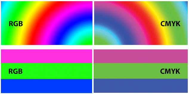
In the world of digital and print design, understanding the intricacies of color modes is essential for creating visually stunning and accurate representations of your creative visions. Two primary color modes, RGB and CMYK, play pivotal roles in this realm.
Each serves a distinct purpose and is optimized for specific mediums. Today, we delve into the differences between RGB and CMYK and explore why they excel in different contexts.
RGB: Radiant Hues for the Digital Canvas
RGB stands for Red, Green, and Blue, the primary additive colors that form the foundation of digital displays, such as computer screens, television monitors, and smartphone screens. This color mode operates on the principle of additive color mixing, where different intensities of red, green, and blue light combine to create a spectrum of colors.
Advantages of RGB:
- Vivid and Luminous Colors: RGB is ideal for digital displays, as it can produce a broad range of bright and vibrant colors.
- Dynamic Range: The additive nature of RGB allows for an expansive gamut, making it suitable for representing a wide array of hues and tones.
- Backlit Illumination: RGB is well-suited for devices that use backlighting, as the colors are created by emitting light directly from the screen.
Think of your computer monitor, phone, or TV. Each pixel is a tiny canvas where the interplay of red, green, and blue light forms the images you see. Higher intensity translates to brighter colors, and their absence plunges the pixel into darkness. This is why RGB excels in the digital realm – it’s the native language of screens, allowing for precise control and a vast range of luminous colors.
CMYK: Rich Pigments for the Print World
CMYK, on the other hand, represents the four ink colors used in color printing: Cyan, Magenta, Yellow, and Key (black). Unlike RGB’s additive model, CMYK employs a subtractive color model, where colors are created by subtracting varying percentages of light-absorbing inks.
Advantages of CMYK:
- Accurate Print Reproduction: CMYK is specifically designed for the print medium, offering precise color reproduction when translating digital designs to physical prints.
- Wide Color Range: While not as extensive as RGB, CMYK still covers a broad spectrum of colors, making it suitable for most printing needs.
- Cost-Effective: Using only four ink colors makes the CMYK printing process more cost-effective compared to using a larger set of colors.
Unlike RGB’s light-based blending, CMYK works by subtracting light. Each ink absorbs specific wavelengths of light, leaving the remaining colors to reach our eyes. Cyan absorbs red, magenta absorbs green, and yellow absorbs blue. Black, however, is a special case. It doesn’t absorb any light; it simply adds depth and richness to the other colors.
Why Choose One Over the Other?
The choice between RGB and CMYK boils down to their intended purpose:
RGB reigns supreme in the digital world: Websites, apps, social media graphics, and videos all rely on RGB’s vibrant spectrum and precise control. Its ability to create luminous and saturated colors makes it ideal for captivating viewers on screens.
CMYK takes center stage in the physical realm: Printed materials like brochures, magazines, and packaging rely on CMYK’s ability to translate digital designs onto physical surfaces. While the color range may be slightly muted compared to RGB, it ensures consistent and predictable results on paper or other materials.
The Nuances of RGB to CMYK Conversion
Converting between RGB and CMYK is inevitable, but it’s not always a seamless process. The inherent differences in their approaches to color can lead to slight variations in the final outcome. Here’s what to keep in mind:
RGB’s wider gamut: RGB can produce colors that are impossible to achieve with CMYK inks. This can lead to color shifts during conversion, especially in vibrant greens and blues.
CMYK’s ink limitations: The limited ink pigments in CMYK can’t perfectly replicate the full range of RGB colors. This can result in muted or duller shades compared to the original digital design.

Bridging the Gap: Tips for a Smooth Transition
To minimize color discrepancies between RGB and CMYK, consider these tips:
- Start with CMYK profiles: When designing for print, choose a CMYK color profile that matches the printing press or paper type. This ensures predictable results.
- Calibrate your monitor: An improperly calibrated monitor can display inaccurate colors. Regular calibration ensures your digital designs are closer to their printed counterparts.
- Use color libraries: Predefined color libraries like Pantone offer consistent color options across both RGB and CMYK spectrums.
Beyond the Basics: Embracing the Power of Both
Understanding RGB and CMYK is just the first step. As you delve deeper into the world of design, you’ll discover a plethora of techniques and tools that leverage the strengths of each model.
For instance, designers often use RGB to create vibrant digital mockups and then adjust them slightly for optimal CMYK printing. Conversely, some printing techniques utilize additional inks or varnishes to achieve effects that mimic the luminosity of RGB.
Ultimately, mastering both RGB and CMYK empowers you to create stunning visuals across all mediums. Embrace their unique strengths, understand their limitations, and bridge the gap between the digital and physical realms. With this knowledge, you’ll be well on your way to painting the world with color, no matter the canvas.
Remember, the key to success lies not in choosing one model over the other, but in understanding the uses and limitations of each.


