Logo redesigns are often pivotal moments in a brand’s history, reflecting changes in strategy, target audience, or market positioning. While some redesigns are met with acclaim, others can be controversial or even disastrous. Let’s explore some notable logo redesigns and the valuable lessons they offer.
APPLE Logo Redesigns: From Rainbow to Sleek Simplicity
Original Logo: Apple‘s original logo, designed in 1976, depicted Sir Isaac Newton under an apple tree. This was soon replaced by the iconic rainbow-colored apple with a bite taken out of it, representing the brand’s focus on creativity and innovation.
Redesign: In 1998, Apple simplified its logo to a monochromatic version, which has since evolved into the sleek, modern design we know today.
Lesson Learned: Simplicity and timelessness are powerful. As brands grow, a simpler logo can ensure versatility and modern appeal without losing brand recognition.

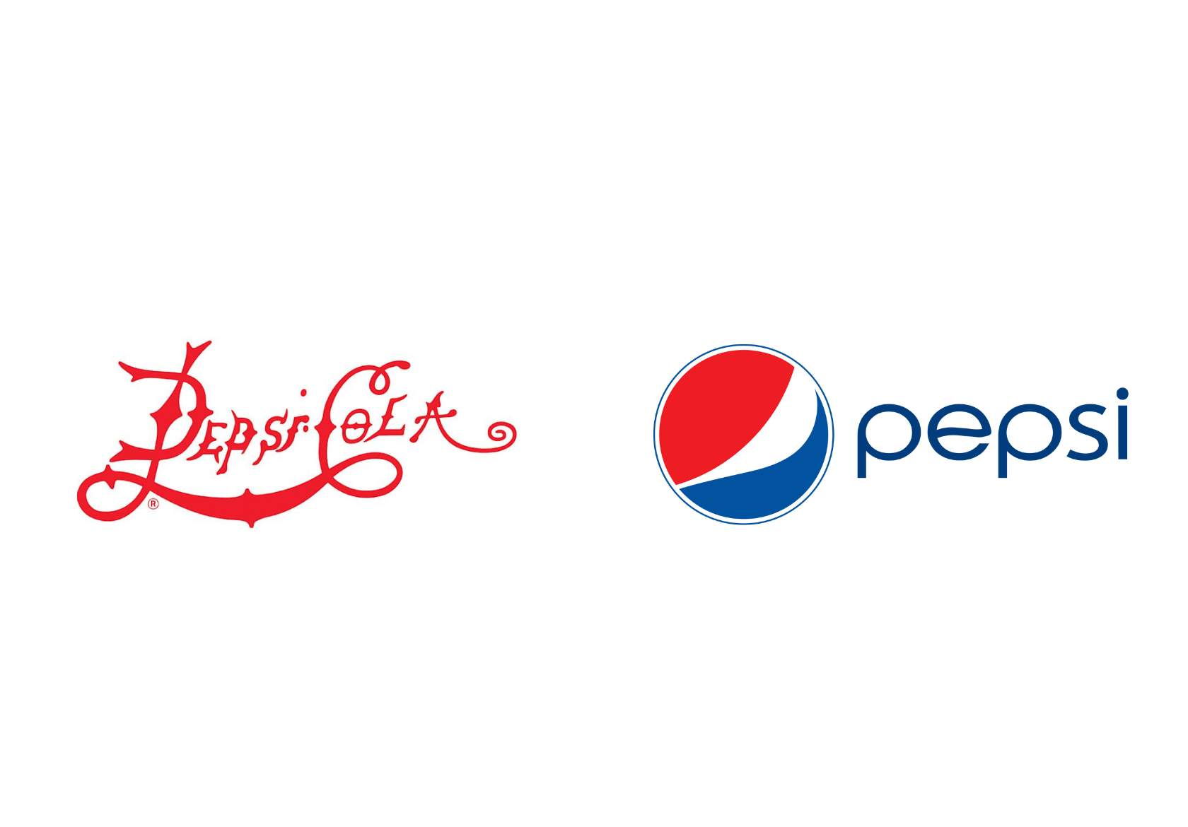
Pepsi: Evolution Through the Decades
Original Logo: Pepsi‘s original logo in 1898 was a complex, ornate design typical of its era. Over the decades, it has undergone numerous redesigns, each reflecting contemporary design trends.
Redesign: The most recent redesign in 2008 saw a significant change, with a more dynamic and spherical look, representing the brand’s global presence and modernity.
Lesson Learned: Continuous evolution can help a brand stay relevant. By updating their logo periodically, Pepsi has managed to stay fresh and connected with new generations while maintaining its core identity.

Gap: The Short-Lived Redesign
Original Logo: The Gap’s classic logo, used since 1986, featured a simple blue box with white serif text.
Redesign: In 2010, Gap introduced a new logo with Helvetica font and a small blue gradient box, which was met with overwhelming negative feedback from customers.
Lesson Learned: Don’t fix what isn’t broken. This redesign taught brands the importance of customer attachment to visual identity. The backlash was so strong that Gap reverted to its original logo within a week. Listening to your audience and valuing their input is crucial.

Instagram: From Polaroid to Gradient
Original Logo: Instagram’s original logo was a detailed image of a Polaroid camera, reflecting its focus on photography.
Redesign: In 2016, Instagram unveiled a radically different logo—a minimalist, gradient icon representing a camera. This change was initially met with mixed reactions but eventually accepted.
Lesson Learned: Embrace bold changes. Sometimes, a significant departure from the original design is necessary to represent a brand’s evolution. Despite initial resistance, a well-thought-out redesign can eventually resonate with users.

Google: Subtle Yet Impactful
Original Logo: Google’s logo has always featured the company name in various fonts and colors, emphasizing simplicity and accessibility.
Redesign: In 2015, Google updated its logo with a new custom typeface called Product Sans and a more modern look, while retaining the iconic color scheme.
Lesson Learned: Small changes can make a big difference. Google’s redesign shows that even subtle tweaks to typography and design can modernize a logo and improve its legibility across different platforms without losing brand recognition.

Tropicana: The Importance of Brand Recognition
Original Logo: Tropicana’s original logo prominently featured an orange with a straw, emphasizing freshness and natural ingredients.
Redesign: In 2009, Tropicana redesigned its packaging and logo, removing the iconic orange image. This led to a significant drop in sales and a backlash from loyal customers.
Lesson Learned: Recognize the value of key brand elements. Tropicana quickly reverted to its original design, demonstrating the importance of visual elements that customers strongly associate with the brand. Maintaining core design elements can be crucial for brand loyalty.
Conclusion
Logo redesigns are complex and nuanced, requiring a balance between innovation and consistency. The key lessons from these iconic logo redesigns include the power of simplicity, the importance of evolution, listening to customer feedback, embracing bold changes, making impactful subtle adjustments, and recognizing the value of key brand elements. By understanding these principles, brands can navigate the redesign process more effectively, ensuring their logos continue to resonate with their audience while reflecting their growth and evolution. Moonlit Media can help you redesign your existing logo and brand to help accelerate your business in the future. Contact us today!


