Your website’s home page is like the front door to your business. If the door is clean, inviting, and welcoming, people are naturally inclined to step inside. But if it’s cluttered, confusing, or unappealing, they’ll probably turn around and move on.

Your home page is often the first interaction a potential customer has with your brand online. This “digital front door” sets the tone for your business and plays a critical role in determining whether visitors stick around or hit the back button. Done well, it can capture interest, build trust, and drive conversions. Done poorly, it can lead to high bounce rates and lost opportunities.
Today, we’ll walk you through the key elements of an effective home page, common mistakes to avoid, and tips for creating a user experience that turns visitors into loyal customers.
Key Elements of an Effective Home Page
Your home page serves as the central hub for your online presence, making it essential to get the key elements right. By focusing on clarity, usability, and engaging content, you can create a home page that draws visitors in and keeps them exploring your site. Below, we’ll break down the crucial components that every effective home page should have.
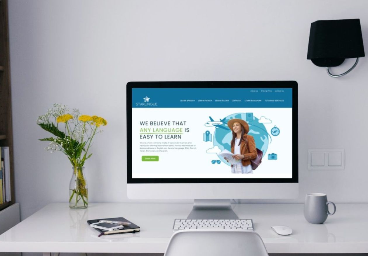
1. A Clear Value Proposition
Your value proposition answers the first question that pops into a visitor’s mind when they land on your site: “What’s in it for me?” Think of your value proposition as your elevator pitch. It should clearly communicate what your business offers and why someone should care. This message must be front-and-center on your home page.
A strong value proposition:
- is concise and simple.
- highlights the specific problem you solve.
- focuses on benefits, not features.
For example:
Notice how these examples immediately tell you what they offer and why it’s valuable. A compelling value proposition helps visitors “get it” within seconds and encourages them to explore further.
2. Compelling Visual Hierarchy
Design matters. A strong visual hierarchy guides the eye to what’s most important first—whether it’s your headline, call-to-action, or that stunning image that tells your brand’s story. When done right, it helps people instantly understand your message without feeling overwhelmed or lost. Think of it as making the online experience smooth and enjoyable, like a friendly conversation that flows naturally.
Principles of a strong visual hierarchy:
- Headline prominence: Place your value proposition or main heading at the top of the page in a large, bold font.
- White space: Don’t overcrowd elements; give your content room to breathe.
- Image placement: Use visuals that complement your text and draw visitors in.
- Font size and color contrast: Ensure your text is easy to read against the background.
A well-structured layout improves your user experience, making visitors more likely to stick around and take action.

3. Engaging, High-Quality Visuals
High-quality images and videos can make your home page pop and capture attention instantly. But remember, visuals should be relevant and representative of your brand.
Tips for using visuals effectively:
- Use professional-quality photos and videos.
- Feature images that align with your target audience’s needs and tastes.
- Optimize all visuals to ensure your page loads quickly.
For example, if you’re a small bakery, showcase your best products with close-up, mouthwatering photos. If you’re a law firm, use visuals that emphasize professionalism and trust.
4. Intuitive Navigation
Your home page needs intuitive navigation to help users find what they’re looking for quickly and easily. If they can’t find essential information, they’re likely to leave your site out of frustration.
Best practices for navigation:
- Keep the menu simple and visible at the top of the page.
- Use clear labels like “About Us,” “Services,” and “Contact Us.”
- Enable easy access to important information like your services, store location, or contact details.
- Ensure your navigation is consistent across all pages.
Remember, user-friendly navigation keeps people exploring your site longer and allows them to take action with ease.
5. Clear Calls to Action (CTAs)
CTAs are necessary in guiding visitors toward the actions you want them to take. Whether it’s signing up for a newsletter, booking a consultation, or making a purchase, your CTA should be clear, action-oriented, and impossible to miss.
Tips for effective CTAs:
- Use active language like “Get Started,” “Shop Now,” or “Learn More.”
- Make buttons visually distinct with strong colors.
- Tailor the CTA to your business goals.
For example, a software business might use a CTA like “Start Your 7-Day Free Trial,” while a restaurant might go with “Reserve a Table Now.”

6. Mobile Responsiveness
With mobile devices accounting for a huge portion of online traffic, a responsive design is non-negotiable. Your home page must look and function seamlessly on all screen sizes.
What is responsive design?
Responsive design adjusts the layout and functionality of your website based on the device being used. For instance, large images and sidebars might stack or resize when viewed on a smartphone.
It also provides click-to-call phone numbers and maps to make it easier for mobile users to get in touch.
Neglecting mobile optimization can hurt user experience, increase bounce rates, and even impact your search engine ranking.
7. Fast Loading Speed
If a potential customer clicks on your website, but it takes longer than three seconds to load, chances are they won’t wait.
How to improve loading speed:
- Optimize images and compress file sizes.
- Minimize the use of heavy scripts.
- Use a reliable hosting provider.
- Enable browser caching.
8. Building Trust and Credibility
When building trust with your audience, sometimes social proof makes the biggest impact. Here’s how you can nail these trust-building elements:
- Customer Testimonials: How often do you check reviews before buying something? Adding real, honest testimonials from your happy customers can work wonders. Seeing others rave about your product or service gives new visitors the confidence to buy.
- Trust Badges: These little icons, like secure payment logos or “Verified Business” badges, immediately reassure visitors that their data and money are safe. If your site screams “secure and legit,” users will feel more comfortable sticking around.
- Industry Certifications: Highlighting your professional affiliations or certifications—like “Certified Partner” or industry-specific awards—signals that you’re the real deal.
- Case Studies or Success Stories: Sharing relatable stories about how others succeeded with your product or service is like handing people proof that you deliver results. It’s one thing to say you’re great, but showing it through real examples? That’s a game changer.
Also, transparency goes a long way. Including your contact details (even something as small as showing your business phone number!) or crafting a warm, relatable “About Us” section lets visitors know there are real humans behind the website.
Trust takes time to build, but with these elements in place, you can make visitors feel welcome and confident in what you offer.
Common Home Page Mistakes to Avoid
Over time, it’s easy for a home page to become bloated or lose focus. Here are some pitfalls to look out for:
Too Much Information
It’s tempting to pack your home page with every detail about your business, but less really is more. Overloading visitors with too many elements competing for attention can leave them feeling overwhelmed. Instead, focus on clear, concise content that highlights your key offerings. Think of your home page as a first impression—a clean, organized structure invites people to explore further.
Unclear Messaging
Your home page should answer one main question right away: “What is this site about?” If people can’t figure out what you do or how you can help them within seconds, they’re likely to bounce. Craft a bold headline or tagline that gets straight to the point, paired with supporting text that reinforces your unique value proposition. Clarity is everything!
Irrelevant Visuals
A website plastered with generic stock images or dull, low-quality photos immediately screams “inauthentic.” Invest in high-quality visuals that reflect your brand’s personality and story. Whether it’s a photo of your team, pictures of your products, or custom illustrations, authentic images can make all the difference.
Complicated Navigation
If visitors can’t find what they’re looking for quickly, they’re out. Menus that are cluttered or overly complex lead to frustration, and frustrated users don’t stick around. Use clear labels and keep navigation simple, preferably limiting your main menu to 5-7 items. Always prioritize the user experience.
Missing CTAs
What do you want visitors to do next? Sign up for a newsletter? Shop your products? Without clear calls-to-action (CTAs), your audience is left to guess, and many will just leave. Your CTAs should be easy to spot, direct, and action-oriented. Use phrases like “Get Started,” “Shop Now,” or “Contact Us” to guide visitors toward their next step.
Slow Loading Times
Patience is in short supply online. If your home page takes too long to load, expect people to drop. Optimize your images, reduce unnecessary scripts, and use proper caching to speed things up. A fast site increases user satisfaction, which boosts your search engine rankings.
No Mobile Optimization
Take the time to ensure your site is fully responsive, with buttons that are big enough to tap and content that’s easy to read.
By tackling these common mistakes head-on, you’ll create a home page that leaves a lasting positive impression. Remember, simplicity, clarity, and user-friendliness are imperative on an effective home page!

Your Home Page: Your Digital Storefront
Your home page is the face of your small business in the online world. It’s your digital storefront, the first impression that can make or break a visitor’s decision to engage with your brand.
An effective home page is more than just visually appealing. It communicates your value proposition, showcases your brand personality, and creates a seamless user experience.
If you’re ready to level up your home page and make a lasting impression, we can help. At Moonlit Media, our expert team specializes in crafting stunning, user-friendly websites designed to grow your business. Contact us today!


