
Ensuring your website delivers a seamless experience across all devices is no longer a luxury, it’s a necessity. Nearly every generation relies on their smartphones to complete even the simplest of tasks. Whether your target audience is Gen X or Millenials, web design should always consider the user experience (UX) and responsive web design.

While mobile web design and responsive design are often used interchangeably, there are some key distinctions to understand.
Mobile Web Design: A User-First Experience
Mobile web design is all about creating a website specifically optimized for smartphones and tablets. It prioritizes elements like:
- Clean and Simple Layouts: Complex layouts and cluttered navigation can be overwhelming on small screens. Mobile web design focuses on clear hierarchy, intuitive navigation, and easy-to-read text.
- Prioritized Content: Not all content is created equal for mobile users. Mobile web design ensures the most important information – contact details, key product features, clear calls to action – is front and center.
- Touch-Friendly Elements: Buttons, menus, and links should be large enough for easy tapping with fingers.
- Fast Loading Speeds: Mobile users are impatient! Mobile web design prioritizes fast loading times to keep users engaged. Images should be optimized for smaller screens, and code should be streamlined.
Responsive Web Design: A Website That Adapts
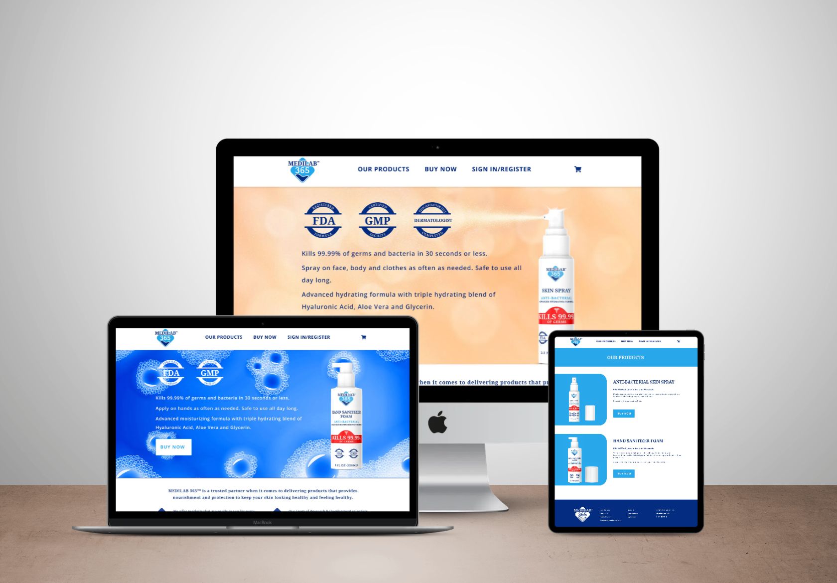
Responsive web design takes mobile web design a step further. It utilizes a flexible layout that automatically adjusts to the size of the screen it’s being viewed on. This means one website can seamlessly adapt to desktops, laptops, tablets, and smartphones, offering an optimal experience for each user. Here’s what makes responsive web design so powerful:
- Media Queries The magic behind responsive web design lies in media queries. This is code that instructs the website to adjust layout, font sizes, and image scaling based on the screen size of the device.
- Fluid Grids: Responsive layouts often utilize fluid grids, a flexible system that allows elements to resize and rearrange themselves automatically to fit the available screen space.
- Scalable Images: Images are a crucial part of any website, but on mobile, they can slow down loading times. Responsive design ensures images are optimized for different screen sizes, delivering a fast and smooth experience.
Benefits of Mobile and Responsive Web Design
By taking a mobile-first approach with responsive design, you gain a multitude of benefits:
- Enhanced User Experience: A website that adapts to any device creates a frustration-free and enjoyable experience for all users, regardless of how they access your site.
- Improved Search Engine Optimization (SEO): Google prioritizes mobile-friendly websites in search results. Responsive design ensures your website ranks higher in mobile searches, driving more organic traffic.
- Reduced Maintenance: Maintaining one responsive website is far easier and more cost-effective than managing separate mobile and desktop versions.
- Increased Conversion Rates: A user-friendly mobile experience is more likely to convert visitors into leads or sales.
Mobile Reigns Supreme
Since so many of us rely on our smart phones for everything from navigating streets to finding a quick bite to eat, prioritizing mobile web design with a responsive approach is crucial for business success. By creating a website that adapts to any device, you’ll ensure a positive user experience, improve your search ranking, and ultimately, achieve your business goals.
Are you ready?
Ready to take your mobile presence to the next level? Contact Moonlit Media today! We specialize in crafting beautiful and responsive websites that will capture the hearts (and clicks) of mobile users.


