Moonlit Media is committed to providing innovative and inviting website designs. We do this with a nod towards current design trends while we strive for long-term usability and appeal that will serve your business now and in the future.
Design trends play a crucial role in shaping the way companies communicate with their clients and partners. The year 2023 has seen a notable shift towards minimalistic design principles in the B2B sector, where simplicity and clarity reign supreme. This is one more reason it’s important to hire a professional web designer for your business website.
Today, we are addressing the growing trend of minimalism in B2B design, highlighting its benefits in conveying professionalism, clarity, and simplicity.
The Essence of Minimalism in design trends
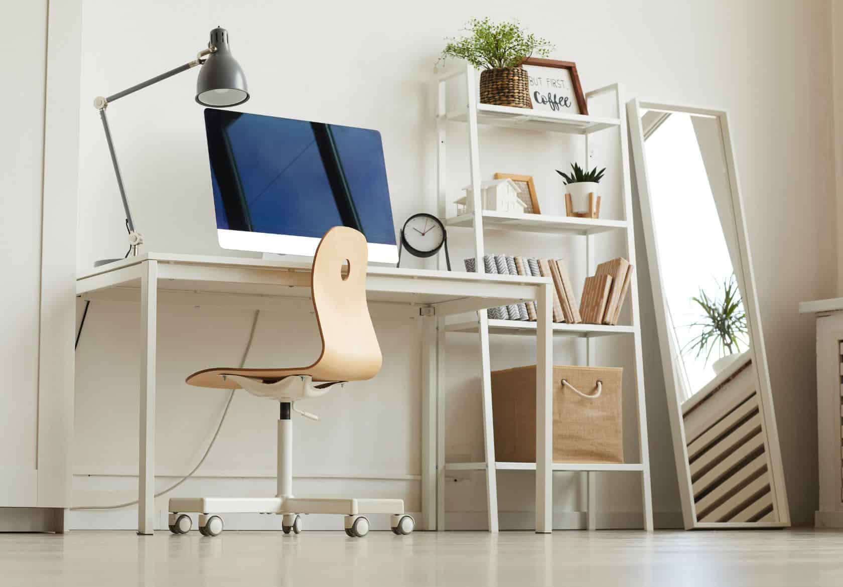
Minimalism, as a design philosophy, centers around the idea of “less is more.” It focuses on stripping away unnecessary elements to present a clean, uncluttered, and visually pleasing layout.
This approach relies on clear typography, ample white space, and a limited color palette to communicate a message effectively. In the B2B context, where information and communication are paramount, minimalism brings a host of advantages.
Convey Professionalism
In the B2B sector, the first impression can make or break a potential business partnership. A minimalistic design exudes professionalism and sophistication.
By presenting a clutter-free interface with well-organized information, businesses can establish a sense of trust and reliability with their clients.
Minimalism reflects a company’s commitment to quality, attention to detail, and a focus on what truly matters – the value they bring to the table.
Enhancing Clarity
Complex products and services often characterize the B2B landscape. Communicating intricate information without overwhelming the audience can be a challenge.
Minimalism excels in simplifying complex ideas.
Through clear typography, concise messaging, and structured layouts, businesses can effectively convey even the most intricate solutions. By removing unnecessary visual distractions, minimalistic design enables clients to grasp the core concepts swiftly, fostering better understanding and engagement.
Simplicity as a Differentiator
Amidst the noise of the digital age, simplicity is a powerful differentiator. B2B clients are bombarded with information from multiple sources daily. A minimalistic design sets a company apart by offering a refreshing and easy-to-digest experience. This design approach not only grabs attention but also holds it.
When clients can navigate a website or marketing material effortlessly, they are more likely to remember and choose that business over its cluttered counterparts.
Mobile-Friendly and Responsive Design Trends
The rise of mobile devices as primary tools for browsing and decision-making has compelled businesses to prioritize mobile-friendliness. This is also why we focus on the components of effective web design at Moonlit Media.
Minimalism seamlessly integrates with responsive design principles.
The clean and uncluttered nature of minimalistic layouts translates well to smaller screens, ensuring a consistent and visually appealing experience across various devices. B2B clients can access critical information without the frustration of zooming and scrolling excessively.
Adapting Minimalism in B2B Design Trends
Embracing minimalism in B2B design requires a thoughtful approach. Here are some key considerations:
1. Prioritize Information Hierarchy:
Identify the most crucial information and structure your design to highlight it. Use typography and layout to guide the reader’s eye to essential details.
2. Choose a Limited Color Palette:
Opt for a restrained color palette that aligns with your brand’s identity. Limiting colors enhances visual harmony and helps maintain a clean aesthetic. Learn more about the importance of color in design here.
3. Utilize Negative Space:
White space, or negative space, is an integral part of minimalism. It creates breathing room around elements and contributes to a sense of elegance and clarity.
4. Focus on Typography:
Typography plays a pivotal role in minimalistic design. Choose fonts that are legible and align with your brand’s tone. Use font sizes, weights, and styles to create contrast and hierarchy.
5. Maintain Consistency:
Consistency in design elements, such as buttons, icons, and imagery, reinforces the minimalistic aesthetic and strengthens brand identity.
The surge in minimalistic design trends within the B2B sector in 2023 is a response to the need for clear communication in a cluttered digital landscape. By conveying professionalism, enhancing clarity, and embracing simplicity, businesses can create a lasting impact on their clients and partners.
As the digital world continues to evolve, minimalism offers a timeless approach to design that ensures effective communication and meaningful engagement. Moonlit Media can help you design or redesign your existing website!


