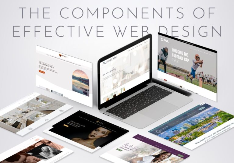
Your website visitors make split-second decisions. Research shows people form opinions about your site in as little as 50 milliseconds. That’s faster than you can blink. This means the top portion of your homepage, what we call “above the fold,” carries enormous weight. It’s the first thing visitors see before they scroll, and it determines whether they stay to explore or bounce to a competitor.
Above the fold refers to the content visible on your screen without scrolling down. The term comes from newspapers, where the most important stories appeared above the physical fold of the paper. For websites, this prime real estate spans roughly the top 600 pixels of your page.
Getting this section right transforms casual browsers into engaged prospects. Let’s break down exactly what belongs above the fold to maximize your conversions.
Why ‘Above the Fold’ Matters
Eye-tracking studies reveal fascinating insights about how people scan websites. Users spend 80% of their viewing time above the fold, with attention dropping dramatically as they scroll down. Your visitors literally judge your entire business based on those first few seconds.
Think of above the fold as your digital storefront window. When someone walks past a physical store, the window display either draws them in or sends them walking. Your homepage works the same way. A cluttered, confusing, or generic above-the-fold section pushes visitors away before they give you a real chance.
Credibility gets established instantly, too. Stanford University researchers found that 75% of users judge a company’s credibility based on website design alone. Professional, clean above-the-fold design signals trustworthiness. Poor design suggests unprofessionalism, regardless of how good your actual products or services might be.

Essential Elements That Belong Above the Fold
Your above-the-fold section needs five core components working together seamlessly.
- Clear Value Proposition
Your value proposition answers three critical questions: What do you do? Who do you help? Why should they care? This isn’t your mission statement or company history. It’s a clear, benefit-focused explanation of the value you provide.Good value propositions are specific and customer-focused. Instead of “We provide innovative solutions,” try “We help restaurants reduce food waste by 30% through smart inventory tracking.” The second version immediately tells visitors what you do, who benefits, and what outcome they can expect.
- Compelling Headline and Subheading
Your headline should grab attention while supporting your value proposition. Skip the clever wordplay and focus on clarity. Visitors shouldn’t have to decode what you mean.Effective headlines often follow proven formulas: “How to [achieve desired outcome] without [common pain point]” or “[Number] ways to [solve problem] in [timeframe].” Your subheading then provides supporting detail or addresses a secondary benefit.
- Strong Supporting Visual
Your hero image, video, or graphic should reinforce your message, not distract from it. The visual needs to connect emotionally with your audience while supporting your value proposition.Avoid generic stock photos of people shaking hands or pointing at laptops. Instead, show your product in action, your team working with clients, or results your customers achieve. Videos can be particularly powerful, but keep them under 30 seconds and include captions for accessibility.
- Primary Call to Action
Your main CTA should offer the most logical next step for visitors. This might be “Schedule a Consultation,” “Start Free Trial,” or “Get Quote.” The button should stand out visually through contrasting colors and clear, action-oriented language.Only include one primary CTA above the fold. Multiple competing buttons create decision paralysis. Secondary actions like “Learn More” can appear lower on the page.
- Clean Navigation
Your navigation menu should include your most important pages without overwhelming visitors. Five to seven main menu items work well for most businesses. If you need more options, use dropdown menus or reorganize your site structure.Make sure your logo links back to your homepage and consider adding a phone number or contact information in the header area for easy access.
Common Above the Fold Mistakes To Avoid
Many businesses sabotage their own success with these frequent errors:
- Cluttered designs that overwhelm visitors with too many competing elements. When everything tries to grab attention, nothing succeeds. Effective above-the-fold design uses white space strategically to guide eyes toward your most important message.
- Generic stock photography that feels inauthentic and forgettable. Those smiling people in business attire don’t connect with your actual customers or communicate your unique value. Invest in custom photography or choose stock images that specifically relate to your industry and message.
- Vague taglines like “Your Success is Our Business” or “Quality Solutions for Modern Challenges” that tell visitors absolutely nothing. These empty phrases waste precious above-the-fold space that could communicate real value instead.
- Burying the call to action below the fold, forcing visitors to hunt for next steps. If someone wants to take action after reading your value proposition, make it easy for them immediately.
Proven Strategies to Boost Above the Fold Performance
- Smart formatting makes your content scannable even for rushed visitors. Use short paragraphs, bullet points, and bold text to highlight key information. Most people scan rather than read every word, so structure your content accordingly.
- Create visual contrast to draw attention to your CTA button. Use colors that stand out from your overall design scheme. Orange and green buttons often perform well because they naturally grab attention without seeming aggressive.
- Test different hero visuals to see what resonates with your audience. A/B testing tools let you compare images, videos, or graphics to measure which versions drive more conversions. What works for other businesses might not work for yours.
- Design mobile-first since most traffic comes from smartphones. Your above-the-fold message and CTA need to be immediately obvious on small screens. Text should be large enough to read easily, and buttons should be big enough to tap accurately.
Real Examples of Effective Above the Fold Design
Great above-the-fold sections share common characteristics while reflecting each brand’s unique personality.

Hubspot’s homepage immediately communicates how their services support their customers. Their CTAs (“Get a demo” and ‘Get started free”) remove friction and make site visitors more likely to explore by not requiring payment upfront. The design is clean and professional without being boring.

Warby Parker’s use of interesting visuals showcasing their products along with clean and simple site navigation encourages visitors to spend more time on their website. Key customer benefits situated just above the fold makes this prime part of their website especially compelling.

Chipotle has mastered the art of enticing customers to order a meal with their above the fold design. They focus on what’s new, a single product or event, rather than trying to show the entire menu at once. Simple navigation, mouth-watering imagery, and a clear call-to-action (“Order now”) make it easy for visitors to quickly decide to place an order.
Above all, effective above-the-fold design should immediately capture attention and entice users to explore further. By utilizing eye-catching visuals, clear calls-to-action, and concise messaging, you can create an impactful first impression on your home page.
Make Your Above the Fold Content Work for You
Your above-the-fold design can make or break your website’s effectiveness. When it’s done right, it builds trust instantly, keeps visitors engaged, and guides them toward becoming customers.
If your homepage isn’t turning visitors into clients, it’s time to fix that. Moonlit Media can help make your above-the-fold section work as hard as you do. Contact us for expert help.


