Designing a logo for your startup or small business can feel like trying to nail jelly to a wall. You want it to be perfect—memorable, unique, and a true reflection of your brand. But often, first-time logo designers fall into common pitfalls that can make their logos forgettable, confusing, or just plain bad.
Here are ten rookie mistakes to avoid when designing your logo, and some tips to make sure your logo is a triumph, not a tragedy.
Logo Design Mistake #1: Overcomplicating Your Design
Simplicity is key when it comes to logo design. Think of iconic logos like Nike’s swoosh or Apple’s…well, apple; they’re simple, clean, and instantly recognizable. A complex logo can be hard to reproduce on different platforms, difficult to read at a small size, and may confuse your audience.
When you find yourself adding a lot of elements, take a step back. Ask yourself if each element is absolutely necessary. If not, simplify.
Example: Instead of intricate graphics and multiple elements, focus on one strong symbol or letter that represents your brand effectively.
Logo Design Mistake #2: Ignoring Your Target Audience
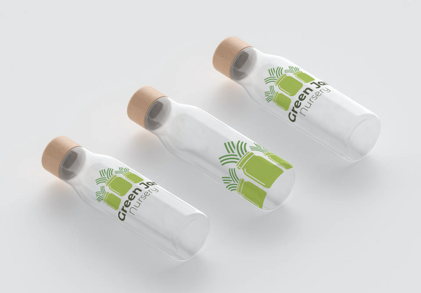
Your logo should resonate with your target audience. If you’re designing a logo for a children’s toy store, it should be playful and colorful. If it’s for a law firm, it should be professional and trustworthy. If it’s for a hair salon, it should be stylish. You get the idea.
Understanding your target market is critical to your success, and that includes your logo design. Do some research and make sure your logo will appeal to the people you want to reach.
Example: When designing a logo for an eco-friendly brand, use earthy tones and natural elements to attract environmentally-conscious consumers. A tech startup targeting millennials might opt for a sleek, modern logo, while a family-owned bakery might go for something warm and inviting to attract local customers.

Logo Design Mistake #3: Chasing Trends
Design trends come and go, but your logo should have staying power. While it might be tempting to follow the latest design fads, remember that a timeless logo will outlast any trend.
Let us have a moment of silence for the defunct Web 2.0 design trend from the 2000s when everyone wanted glossy logos with drop shadows, reflections, and gradients. (As designers, we are hoping that’s one trend that never makes a comeback!)
Instead of following a trend, focus on creating a design that reflects your brand’s core values. A classic logo will remain relevant for years to come, saving you the hassle of frequent redesigns.
Example: Instead of using a trendy fluorescent color palette or a scribble design that’s popular this year, stick to color palettes and classic shapes that speak to your audience and can stand the test of time.

Logo Design Mistake #4: Overusing Colors
A limited color palette creates a cohesive and memorable look. Using too many colors can make your logo look cluttered and unprofessional. Stick to no more than three colors that complement each other and your brand.
Colors evoke emotions and can influence how your brand is perceived. Choose colors that align with your brand’s personality and message. Consider blues, greens, and purples for a professional and trustworthy feel, while bright and bold colors like red, orange, and yellow can convey energy and excitement. Natural tones are a solid choice for eco-friendly or organic brands, while bright colors can be used for playful or youthful brands.
Example: The McDonald’s logo is a well-known example of using red and yellow to create an energetic and playful brand image. On the other hand, the blue and white colors used in the IBM logo convey trust, reliability, and professionalism.
Logo Design Mistake #5: Poor Font Choices
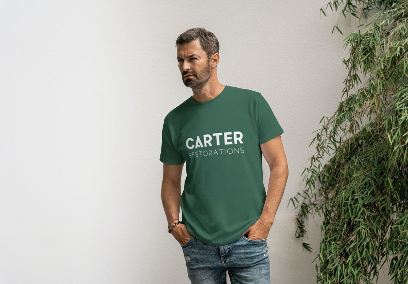
The right font can elevate your logo, while the wrong one can ruin it. Select fonts that complement your brand’s personality and are easy to read. Avoid overly decorative fonts that are hard to decipher. A childish font, like Comic Sans, would never be appropriate for a law firm’s logo (or just about any other logo, to be honest). A sweeping handwritten script would be an awful choice for a tech company’s logo. These are silly examples, but even the most basic fonts can have a big impact on how your logo is perceived.
Also, consider how your font will look at different sizes. A thin and delicate font may not be legible when scaled down for a business card or in your website footer. Test your logo in various sizes to ensure it is still readable and packs the same punch.
Example: The New York Times logo uses a classic serif font that reflects the newspaper’s authoritative and established image. In contrast, the font used in the Airbnb logo has a more modern and casual feel that reflects their innovative and youthful approach to travel.
Logo Design Mistake #6: Neglecting Typography
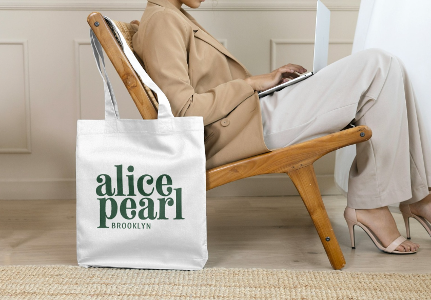
Typography encompasses more than just font selection. Once you’ve found the perfect font for your logotype, don’t forget to perfect it by adjusting the letter spacing, line height, and overall balance. Proper typography ensures that your logo is not only visually appealing but also functional.
Pay attention to the details. Even small adjustments in kerning (the space between individual letters), tracking (the space between all the letters of a word), and leading (the space between the lines) can make your logo look more polished and professional.
Example: Google’s logo uses simple, clean typography with carefully considered spacing between letters to achieve a balanced look.

Logo Design Mistake #7: Forgetting About Scalability and Versatility
A logo needs to be versatile and scalable to maintain its integrity at any size, from business cards to billboards to being flown on a banner behind a plane. Your logo should look good at all sizes, and be recognizable whether it’s displayed as a tiny icon on a website or as a large image on a marquee in Times Square. This is a non-negotiable because your logo will be reproduced in numerous formats, and a design that loses clarity when resized will weaken your brand identity.
Equally important is ensuring that your logo performs well on both light and dark backgrounds. At some point, your logo will need to be placed over a photo or printed on a dark t-shirt. So you’ll need to see how your logo looks when the colors are reversed, or changed to all white, and placed on a dark background.
To achieve this level of versatility, logos should always be designed in vector format. Vector graphics allow for infinite resizing without loss of quality, making them ideal for diverse applications. Unlike raster images, which can become pixelated when enlarged, vector files maintain crisp lines and clean edges at any size. It’s also extremely easy to change colors if you’re working with a vector logo.
Example: The Starbucks logo maintains its clarity and detail whether it’s printed on a tiny coffee cup or a huge storefront sign.

Logo Design Mistake #8: Ignoring Your Competitors
Researching your competitors’ logos is like window shopping before you dive into your own design. It gives you a clear view of what’s trending in your industry and helps pinpoint what works — or doesn’t — in their branding. You wouldn’t want to accidentally create a logo that looks like it just rolled off of the same design conveyor belt as everyone else, right? So, take a good look at their color schemes, shapes, and typography.
While imitation might be the sincerest form of flattery, it’s important to carve out your own niche. Your logo should scream “me” rather than “copycat!” Aim for originality that not only fits within your industry but also encourages people to take notice. Remember, no one ever said, “Oh joy, another logo that looks just like the rest!” So, channel your creative energy into crafting a design that reflects your brand’s personality and resonates with your audience.
Example: If all your competitors use a certain color scheme, consider choosing a different color palette to differentiate your brand. For example, blue is ultra-common in the medical industry, so why not go for teal, purple, or a lovely green instead?

Logo Design Mistake #9: Ignoring Valuable Feedback
When it comes to designing your logo, being open to constructive criticism is key—think of it as gathering valuable nuggets of wisdom instead of just a bunch of opinions. Your colleagues, friends, and potential customers can provide insights that you might not have considered while you’re deep in your creative bubble. Sometimes, you might be too close to the design to see that your elegant script looks more like a shopping list written in a hurry than a logo! So, don’t be shy about asking for feedback at various stages of the design process, whether it’s a quick chat over coffee or a more formal review session.
Using feedback isn’t about letting everyone’s opinion dictate your vision—it’s about making informed adjustments and improvements. Remember, even the best designers sometimes find their ideas getting a reality check when they share them. So, embrace that critique and let it help sharpen your design. Who knows? By keeping your ears open and your feelings in check, your logo might evolve from ‘just okay’ to ‘absolutely fabulous’! After all, you want your logo to resonate with your audience, not make them question your taste in graphics!
Example: Share your logo drafts on social media, with friends and family, colleagues, or with a focus group to get diverse opinions and insights. You’ll be surprised by the feedback you get.
Logo Design Mistake #10: Not Seeking Professional Help
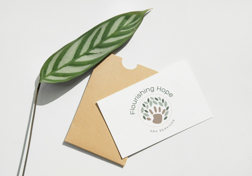
Consulting with a professional designer may feel like handing over the keys to your creative castle, but it’s more akin to inviting a skilled artist to turn your great ideas into a tangible masterpiece.
Professional designers are equipped with the tools and know-how to craft a logo that isn’t just nice to look at but is also a powerful ambassador for your brand. They take the time to understand your vision, your audience, and your goals, pulling together ideas that resonate and stick.
Imagine your logo standing out in the crowded marketplace, shouting, “Hello world, here I am!” instead of mumbling in the corner. So before you pour too much time into trying to make your artwork resemble a masterpiece, give a professional a shout. Your brand will thank you!
Example: Moonlit Media offers expert logo design services to create a memorable and impactful logo for your brand. We’re proud of our portfolio and we’d love to add your logo to it!
Final Thoughts
Your logo is the face of your brand, and it’s often the first thing people see and remember. Avoid these common design mistakes to ensure that your logo accurately represents your brand while standing out in a crowded marketplace. And remember, investing in a professional designer can be worth every penny when it comes to creating a powerful and successful logo for your business. Keep these tips in mind, stay open to feedback, and trust in the expertise of Moonlit Media to help you create a logo that truly captures the essence of your brand.


