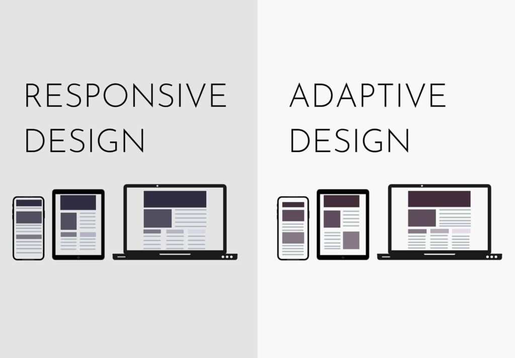
In today’s mobile-centric world, ensuring a seamless user experience on smartphones and tablets is a priority for web designers and graphic artists. Responsive design is the key to adapting digital content to various screen sizes and orientations, and this extends to the graphics used on websites and mobile apps. This is just one of the many components of effective web design.
This week, we will explore the importance of creating graphics for a mobile-friendly experience and provide tips on how to achieve this effectively.

The Significance of Mobile-Friendly Graphics
Mobile devices have become the primary means of accessing online content. As a result, optimizing graphics for mobile is not just a nice-to-have but a necessity. Here’s why it matters:
Enhanced User Experience:
Mobile-friendly graphics ensure that users can access and interact with your content effortlessly on small screens. This improves user satisfaction and encourages longer engagement.
Faster Loading Times:
Optimized graphics are typically smaller in file size, leading to quicker loading times on mobile devices. This is crucial because mobile users have shorter attention spans and expect fast-loading content.
Reduced Bounce Rates:
A poor mobile experience, including improperly scaled or distorted graphics, can lead to higher bounce rates as users quickly abandon a website or app that doesn’t meet their mobile needs.
Improved SEO:
Search engines like Google favor mobile-friendly websites, and responsive design, including mobile-friendly graphics, is a key factor in SEO rankings.
Creating Mobile-Friendly Graphics
Now that we understand the importance of mobile-friendly graphics, let’s delve into some essential strategies for creating them:
Prioritize Scalability:
Start with vector graphics or high-resolution images that can be scaled without losing quality. Scalable Vector Graphics (SVGs) are an excellent choice for logos, icons, and simple illustrations.
Responsive Images:
Use the “srcset” attribute in HTML to serve different image sizes based on the user’s device, screen size, and resolution. This ensures that users receive appropriately sized images.
Optimize File Sizes:
Compress and optimize images to reduce file sizes without compromising quality. There are many online tools and image optimization software available for this purpose.
Consider Image Format:
Use the appropriate image format for different types of graphics. JPEG is suitable for photographs, while PNG is better for images with transparency, and WebP offers excellent compression for the web.
Use Media Queries:
CSS media queries allow you to adjust image sizes, positioning, or even swap images based on the device’s screen width or orientation.
Test Across Devices:
Regularly test your website or app on various devices and browsers to ensure that graphics adapt correctly. Emulators and real device testing are both valuable.
Touch-Friendly Interaction:
Make sure that interactive elements, such as buttons or navigation icons, are appropriately sized for touch input on mobile devices.
Maintain Brand Consistency:
While adapting graphics for mobile, ensure that your brand’s visual identity remains consistent across different screen sizes and orientations.
Tools for Creating Mobile-Friendly Graphics
To assist in creating mobile-friendly graphics, consider using these tools:
Adobe Creative Cloud:
Adobe’s suite of design software, including Photoshop and Illustrator, is ideal for creating and optimizing graphics.
Canva:
An online graphic design tool with templates optimized for various social media and mobile formats. Read more about how to use the Canva tool properly.
Figma:
A collaborative design tool that allows for responsive design and real-time collaboration with team members.
ImageOptim:
A Mac application for compressing and optimizing image files.
TinyPNG:
An online tool for compressing PNG images with minimal quality loss.
Creating graphics that provide a seamless and visually pleasing experience on smartphones and tablets is essential. Responsive design, combined with careful consideration of image format, size, and optimization, ensures that your graphics adapt to the diverse range of devices used by your audience.
By prioritizing mobile-friendly graphics, you not only improve user satisfaction but also enhance your website’s performance, SEO, and overall success in the digital landscape.


