If you’re a small business owner, chances are you’ve thought about your logo more than once…maybe when you first launched, maybe when it stopped feeling “right,” or maybe when you realized it doesn’t work everywhere you need it to.

A logo isn’t just a visual. It’s often the first impression someone has of your business. Before they read your website copy, scroll your socials, or talk to you directly, your logo is already doing work behind the scenes.
So what actually makes a good logo? And how do you create one that lasts?
In this article, we’ll break down what actually makes a logo effective and walk through the 7 key elements behind memorable brand marks.
What a Logo’s Job Really Is
Before we talk about shapes, fonts, or colors, let’s get one thing straight: a logo’s job is recognition, not explanation.
A logo doesn’t need to tell your whole story. It doesn’t need to list your services or explain how you’re different. Its job is to help people recognize you, remember you, and associate your brand with a certain feeling or expectation.
Think about Nike. The swoosh doesn’t say anything about shoes, apparel, or performance. But you instantly know the brand, the vibe, and what it represents. That’s the goal of a logo.
The 7 Key Elements of Good Logo Design
While every brand is different, truly effective logos tend to share a few common traits. These seven elements show up again and again in logos that stand the test of time. They’re a helpful framework for understanding what actually makes a logo work in the real world.
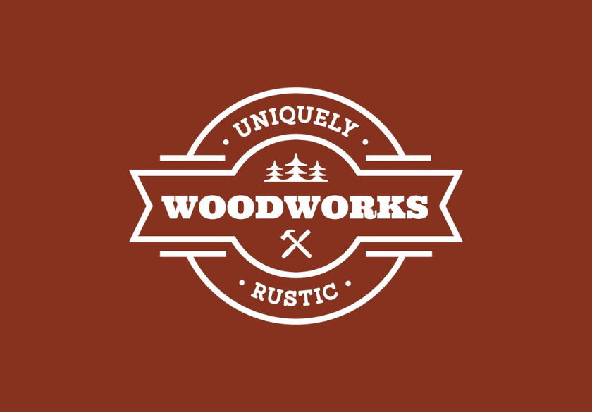
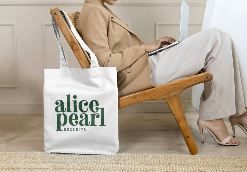
1. Simplicity Is The Foundation of a Good Logo
Simple logos work better. They’re easier to recognize, easier to reproduce, and easier to remember, which matters more than most people realize. Logos show up everywhere: tiny on a phone screen, cropped into a social profile, printed on packaging, embroidered on a shirt, or scaled up on a sign. When a logo is too detailed, those details are the first thing to disappear.
Overly complex logos also tend to create problems behind the scenes. They require more variations, more cleanup, and more explanation about how (and when) they should be used. That’s not just a design issue, it’s a consistency issue, and consistency is what builds brand recognition over time.
Apple is a great example. The logo is clean, minimal, and instantly recognizable at any size, in any color, on any background. The same goes for McDonald’s. The golden arches don’t rely on words, taglines, or extra elements to do their job. They work because they’re simple enough to be understood in a split second.
For small businesses, simplicity doesn’t mean generic or boring. It means deciding what matters most and letting go of anything that doesn’t support recognition. A simple logo gives your brand room to grow and saves you from constant redesigns later on.
2. Memorability: Standing Out Without Chasing Trends
A good logo sticks in your mind and that usually comes from one strong idea, not ten competing ones.
Memorable logos often have:
- A clear shape
- A distinct visual cue
- A clever (but subtle) detail
The Target logo is a perfect example. It’s literally a target and once you see it, you never forget it. FedEx is another classic example. The hidden arrow between the E and the X reinforces movement and delivery without screaming for attention.
Trendy logos might look cool today, but memorability comes from clarity and consistency over time.
3. Versatility: A Logo Has to Work Everywhere
One of the most common logo problems we see is logos that only work in one place.
A good logo needs to function:
- On your website
- On social media
- In print
- On signage
- In color and black and white
The evolution of the Starbucks logo is a great example of improving versatility. Over time, they simplified the logo, their ‘siren’ the twin-tailed mermaid, so it could stand alone with no text required.
If your logo falls apart when it’s small, loses meaning without color, or needs a specific background to work, it’s not doing its job.
4. Color: Strategic, Not Just “What Looks Good”
Color matters, but not just because it looks nice. In logo design, color is one of the fastest ways people recognize and remember a brand.
Strong logos use color strategically to create emotion, expectation, and instant association. Think Coca-Cola red—it signals energy, familiarity, and tradition. Or the instantly recognizable brown of UPS, which reinforces reliability and dependability. Over time, these colors become shorthand for the brand itself.
That said, a good logo should never rely only on color to work. If a logo falls apart when it’s printed in black and white, photocopied, or viewed without color, it’s fragile. Strong logo design starts with a solid mark that works in one color first, then uses color as an enhancement, not a crutch.
For small businesses, fewer colors usually lead to smarter outcomes. Limited color palettes lead to easier and more affordable printing, fewer variations to manage, and more consistent use across platforms. They also help your logo stand out more clearly, making it easier for customers to recognize you at a glance.
5. Typography: Fonts Carry Personality
Typography does a lot of heavy lifting in logo design. Before someone reads a single word about your business, your font choice is already communicating personality, tone, and credibility.
Rounded fonts tend to feel friendly, modern, and approachable. Serif fonts often feel established, trustworthy, and traditional. Custom lettering can feel iconic and distinctive, but be careful that it’s done with intention and restraint.
Google’s logo is a great example of typography supporting brand values. The letterforms feel clean, simple, and welcoming, which aligns perfectly with a brand built around accessibility and ease of use. Disney’s custom lettering, on the other hand, is playful and unmistakable. It immediately sets a tone of imagination and nostalgia before you think about movies or theme parks.
Typography also affects how practical your logo is in everyday use. Fonts that are too thin, overly decorative, or overly trendy can be difficult to read at small sizes or can feel dated very quickly. That creates issues when your logo needs to work on everything from social profile icons to signage and print materials.
Choosing a font because it’s popular right now is risky. Choosing one because it reflects your brand’s personality, works across sizes and platforms, and will still feel right years from now is what makes a logo strong.

6. Relevance: A Logo Should Match the Brand
Sure, a good logo looks nice, but it also feels right for the business it represents. When a logo matches the brand’s personality, industry, and audience expectations, it builds trust almost instantly.
The bold, rugged look of Harley-Davidson wouldn’t make sense for an organic grocery brand. And the friendly, natural feel of Whole Foods wouldn’t work for a heavy equipment company. Each logo works because it aligns with what customers expect from that brand.
This is where many DIY logos miss the mark. They’re often designed around personal taste instead of audience perception. What you like visually isn’t always what communicates credibility to your customers.
A relevant logo helps the right people recognize that they’re in the right place. It sets expectations, reinforces your positioning, and supports your overall brand story.
7. Timelessness: Designed for the Long Game
A good logo should last years, even decades, not months. While small refinements over time are normal, constant redesigns are expensive and confusing for customers.
Timeless logos focus on clarity and structure instead of trends. IBM and Coca-Cola are great examples. Their logos have been refined and modernized over time, but the core elements remain recognizable. That continuity builds trust and brand equity year after year.
When logos chase design trends too closely, they tend to age quickly. What feels fresh today can feel dated surprisingly fast, leading to unnecessary rebrands that dilute recognition.
A timeless logo gives your business stability, consistency, and room to grow without needing a reset every few years.
How to Create a Good Logo (Hint: Process Matters)
If you’re wondering how to create a good logo, here’s the part most people skip: it’s a process, not a design moment.
Creating a good logo starts with clarity. You need to understand who the brand is for, what you want people to feel when they see it, and how the logo will actually be used in the real world: on a website, social media, signage, print, and beyond. Without that foundation, even a great-looking logo can fall flat.
Next comes exploration, not execution. This is where ideas are tested, simplified, and pressure-tested against the seven elements above. Does it work at small sizes? Does it make sense without color? Does it still feel right for your audience, not just your personal taste?
Only after that groundwork is done does visual design begin. That’s when shapes, typography, and color choices come together in a way that’s intentional.
Rushed logos, AI designs, and other DIY shortcuts usually skip these steps, which is why they often lead to redesigns later. A thoughtful, strategic process creates logos that last, work everywhere, and actually support your business instead of creating more work down the line.
Common Logo Mistakes Small Businesses Make
Some of the most common issues we see come from good intentions but they create real problems down the road. One of the biggest is trying to explain everything in a single logo. When a logo is overloaded with symbols, taglines, or details, it becomes harder to recognize and easier to forget.
Another frequent mistake is designing based on personal preference instead of audience perception. What you like isn’t always what communicates trust or credibility to the people you’re trying to reach. Remember, a logo isn’t for you, it’s for your customers.
Ignoring scalability is another common issue. Logos might look fine on a website header, but fall apart when they’re shrunk for social media, printed on merchandise, or used in black and white. If a logo can’t adapt, it creates constant workarounds.
And finally, chasing trends often leads to logos that age quickly. What feels fresh today can feel dated sooner than you expect, forcing unnecessary redesigns. (Anyone remember the 3D bubble trend from a few years ago?)
A logo should support your business, not create extra work.
How Moonlit Media Approaches Logo Design
At Moonlit Media, we design logos as part of a bigger brand system, not as isolated graphics.
Our process starts with getting clarity. We take time to understand the who, where, and how before we ever open a design file. We design memorable, versatile logos that work across platforms, grow with your business, and don’t need constant reworking.
A Good Logo Is a Business Tool
A good logo isn’t flashy or trendy. It’s clear, consistent, and recognizable, so people know who you are and remember you long after they’ve seen your brand.
If your current logo feels limiting, dated, or harder to use than it should be, that’s a sign it’s time for a more intentional approach. Contact Moonlit Media to create a logo that’s strategically designed to support your business, grow with your brand, and work everywhere you need it, right now and well into the future.


