
Your website is the digital storefront of your business. It’s often the first thing potential customers see—and we all know what they say about first impressions, right? But here’s the deal: Many businesses unknowingly make web design mistakes that drive visitors away instead of drawing them in.
The good news is these issues are all fixable. Whether you’re a small business owner trying to DIY your site or a web designer crafting client projects, understanding these common website design mistakes will lead to a better, more engaging website.
From poor navigation to inconsistent branding, here are five common website design mistakes and tips on how to avoid them.

Mistake #1: Poor Website Navigation
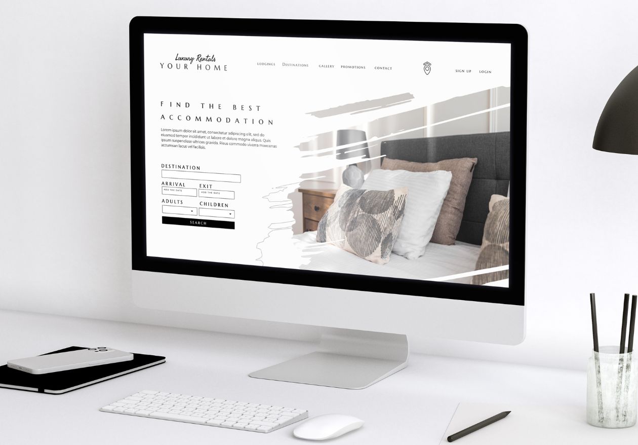
Have you ever walked into a store, couldn’t figure out where things were and left frustrated? A poorly designed website navigation does the exact same thing online. And poor navigation leads to high bounce rates, frustrated users, and (worst of all) missed conversions.
Your visitors need a clear and intuitive way to explore your site. If your navigation feels more like a puzzle than a map, it’s time for a redesign.
How to avoid this website design mistake:
- Keep your navigation menu simple and easy to understand. Use clear and concise labels for each category or page.
- Limit the number of categories in your menu to avoid overwhelming visitors.
- Add a clear search bar so users can find anything in moments.
- Use category-based dropdowns instead of overwhelming your visitors with endless links squished into one spot.
If you’re feeling stuck, hire a professional web designer. They have the expertise to create a seamless navigation experience that makes browsing a breeze.


Mistake #2: Slow Loading Times
Patience might be a virtue, but in the digital world, it’s a rare one. Did you know that 47% of users will abandon a site if it takes longer than 2 seconds to load? Your website could be full of amazing content, but if it’s slow, no one’s sticking around to see it.
Search engines, especially the almighty Google, love sites that load faster than a cheetah. So, if you want to stay at the top of those search engine ranks, make sure your site loads at lightning speed.
Site speed is also a major player when it comes to user experience. Your website visitors may be eager to see what you offer. But if your site is slower than a sloth, they’re not gonna stick around.
And let’s not forget about conversions. Did you know that each additional second of delay in page loading can reduce your conversions by a whopping 7%?[source] A sluggish website literally lets your potential customers slip away in slow motion.
How to avoid this website design mistake:
- Optimize images by compressing their sizes without losing quality (try tools like TinyPNG).
- Minimize code and use clean HTML, CSS, and JavaScript.
- Leverage browser caching so returning visitors don’t have to reload everything from scratch.
A faster site means happier users—and happier users lead to conversions.


Mistake #3: Inconsistent Branding
Imagine a McDonald’s with purple arches instead of golden ones… weird, right? Consistent branding builds trust, recognition, and credibility. If your website uses three logo designs, five different fonts, and random color schemes, your visitors will wonder if they’re in the right place—or subconsciously, if they can even trust your brand. Visitors don’t want to play detective, wondering if they’ve wandered into a bizarre alternate reality.
So, what happens when your branding goes off the rails? First, a lack of trust. An inconsistent look screams “unprofessional” to visitors, and that’s not a message you want to send. You want them to have faith in your expertise and reliability, not question whether you’re running a circus (unless, of course, you ARE running a circus, in which case, carry on!).
Next, lost identity. If your branding is all over the place, visitors won’t recognize or remember your brand. You want your brand to be memorable.
Finally, we have chaos over clarity. Too many fonts and colors make your content harder to read, and nobody has time for that. Keep it clean, keep it simple, and your visitors will thank you.
How to avoid this website design mistake:
- Develop and stick to style guidelines that include consistent colors, logos, and typography.
- Keep your tone of voice consistent across headlines, blogs, and product or service descriptions.
- Use a cohesive set of images that align with your brand story—not just generic stock photos.
Not sure where to start? Collaborate with a design agency to create a clear brand identity that translates beautifully across your site.


Mistake #4: Poor Mobile Experience
Mobile traffic accounts for over 50% of all global web traffic. If your site isn’t mobile-friendly, you’re alienating a huge chunk of your audience.
Picture your users, fingers furiously pinching and zooming, desperately trying to navigate their way through your website on their phones. Multiple scrollbars popping up, blocking the content they’re trying to read. It’s a recipe for frustration.
And let’s not forget about Google, the gatekeeper of search rankings. If your site isn’t mobile-friendly, you can kiss those sweet rankings goodbye.
The fact is, visitors are less likely to engage with your content if it’s a hot mess on their phones. Can you blame them?
How to avoid this website design mistake:
- Use a responsive design, so your site automatically adjusts to all screen sizes.
- Make CTA buttons “thumb-friendly”—large and easy to tap.
- Optimize mobile loading times, particularly for image-heavy pages.
Remember, your website should feel like it was built for both desktop and mobile—because that’s exactly what users expect.


Mistake #5: Ignoring User Experience (UX) Design
Your website exists for one person—your users. If you’re ignoring their needs, preferences, and pain points, your site won’t convert visitors into customers, no matter how pretty it looks.
Low satisfaction is one major consequence of poor UX design. And we all know, a happy user is more likely to stick around, engage with your content, and become a loyal customer.
Confusing layouts can be a breeding ground for missed opportunities. If your visitors can’t find what they’re looking for or get lost in a maze of buttons and links, you might as well wave goodbye to those leads, sales, and sign-ups. So make sure your UX design leads people in the right direction.
How to avoid this website design mistake:
- Perform usability testing—ask real users to interact with your site and collect feedback.
- Use clear and concise CTAs on every page. A single button that says “Sign Up” does wonders!
- Streamline content by removing unnecessary clutter. Think simplicity, not information overload.
Great UX is not about flashy elements—it’s about functionality, accessibility, and putting your users first.

Invest in Professional Web Design
Your website is at the core of your digital presence. Avoid costly mistakes by prioritizing intuitive navigation, faster loading speeds, consistent branding, mobile optimization, and user-focused design.
Feeling overwhelmed by where to start? The team at Moonlit Media can help. With expert designers and developers on board, we create websites that not only look amazing but also perform brilliantly.
Contact us today to build a site that drives real results—and leave these mistakes behind for good.


